CSUEB Web Redesign
Team
Jinthana, Bansari, Jing, Jonathan
My Role
User Research, Empathy Map, User Journey Map, Heuristic Evaluation, UI Flows, High Fidelity Wireframes.
Design Challenge
Redesign the Website for CSUEB Multimedia Graduate Program. The focus for this website is based on the User-Centered Design Experience that makes it user-friendly, and easier to navigate the site.
Target Audience
Our target audience will be the people who generally completed their University Diploma, and interested in pursuing Interaction Design. People age from 18-50 whether having interaction design knowledge and or not. People who have got experience in the computer industry, digital media, multimedia discipline, or Information designing.
User Research
We began with a lot of user research since we wanted to focus on the user-centered design experience. We wanted to interview different groups of people and understand what are their thoughts and experiences from this site.
We started off by interviewing the graduate students that currently enrolled in the CSUEB multimedia program, and then we interviewed people who have thought to apply to the Multimedia graduate program that is an undergraduate student. Lastly, an interview has done by my teammates, who is checking out information for her son who is an undergraduate student of CSUEB.
User 1: "Sally" - Current graduate student at CSUEB
During Sally's interview, we asked her to visit the Multimedia graduate program website from CSUEB, and we observed her reaction and thoughts during this interview. She thought it was confused that the Apply button on the application page was not clickable, and the Italics and color-coded subheads are not clickable*.*
Pain Points for Sally: "This is confusing and frustrating"
Pain Points are the issues and problems that users experience.
She mentioned that because the APPLY BUTTON doesn't work on the application page, she had to do extra steps to go to other pages and to apply to the program.
She also mentioned that the Image slider image does not load for each page, and that makes her feel frustrated. She expressed it many times " Why the Images are not loading?"
Overall, Sally's experience with this website is confusing and frustrating.
Sally's Problem Statements:
Could not recognize that "Overview, Admission, Apply" on the homepage are clickable at the first glance
Consistency of the page layout
Weird Italic link fonts but not clickable
The distraction of the colors
Application Straight to the point
Sally's Empathy Map
Empathy map for Sally that shows her emotions, expressions, body language during her interactions in the Interview
User 2: "Bob" - Undergrad student at CSUEB
Bob is an undergrad student who is interested in the Multimedia Graduate program. In this interview we wanted to observe a different version from Sally's interview, so we asked Bob to use the phone to browse the Multimedia website.
Pain Points: Oh boy!
Another issue he has with this mobile version was there is a lot of scrolling on his mobile phone. He also said there are repeated sections on each page. For example, the "Faculty and Staff" section on other pages worded as "People". He thought they would be different sections; however, when he clicked them, they are the same page.
Bob's Problem Statements
Make the header and each section more clear and consistent
Combine the information of the page
Empathy map for Bob that reflected his emotions, expressions, and his body language
User Journey Map
The user journey map shows the journey that Jonathan from the beginning to the end of his interactions with the website on his mobile phone. We asked him to finish apply the whole application process on his mobile phone, and the Journey map down below showed his moments of emotions.
Jonathan’s Use Journey Map shows his moments of emotions through out the application process
Google Analytics
Google Analytics is a very popular tool to measure visitors to your business. Our team decided to use it to measure the traffic of this website. We specifically measured the traffic of each page where most people click during visiting this website, which was the Admission page, and along with what devices do most people use to visit this site.
Google Analytics measures traffic of this website (I was not a part of this)
We use the Google Analytics Pie Chart to measure Users v Device Category. It results in 75.2% of users visit on their Desktop, 22.4% of users visit on their Mobile Devices, and the rest 2.4% of users visit on their Tablets.
Google Analytics measures of Users v Device Category (I was not a part of this)
Heuristic Evaluation
Moving on to this next phase of this project, Heuristic Evaluation. Heuristic Evaluation is a user inspection tool to evaluate the computer software's User Interface Design.
For this evaluation, we used the heuristics developed by Jakob Nielsen(1994) in the chapter "Heuristic Evaluation" in the Usability Inspections Methods.
Our team of four decided to use this evaluations to scope the problems findings. We based on the finding scale from 1-4, by counting everyone's votes and in an average score lower than 2 is a problem finding.
1. This represents frustration
2. This represents taking too much time
3. This represents as being understandable
4. This represents that there is no thinking involved in this action
After the Evaluation: After the whole team worked together, we found 13 Problem Findings. While making a more simple and useable user interface for the website with our limited time, our team decided to focus on the Application Process Redesign.
Original - Home Page
Since we only had 4 weeks to work on this project, we decided to focus on solving the experience on application process.
UI Flows and Shorthand Notation
Moving on to the next phase which is hands-on sketches, wire-framing, shorthand notations, and user flows.
We decided to focus on the redesign of the application process for both the department application site and the University application site. Another focus is to maximize the user experience for the students who are interested in applying to this program.
User Flows for application process
Initial Brainstorming
We have a few versions of the design that we wanted to use, but we start asking the question of what problem that we are trying to solve. Back to the beginning, we want to minimize the clicking on Applications
Low Fidelity Wireframes
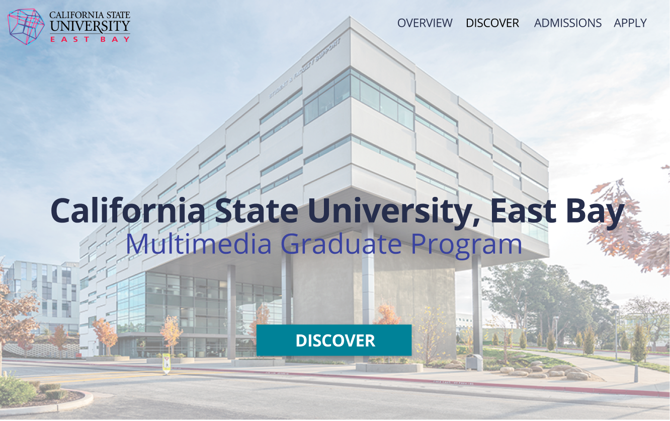
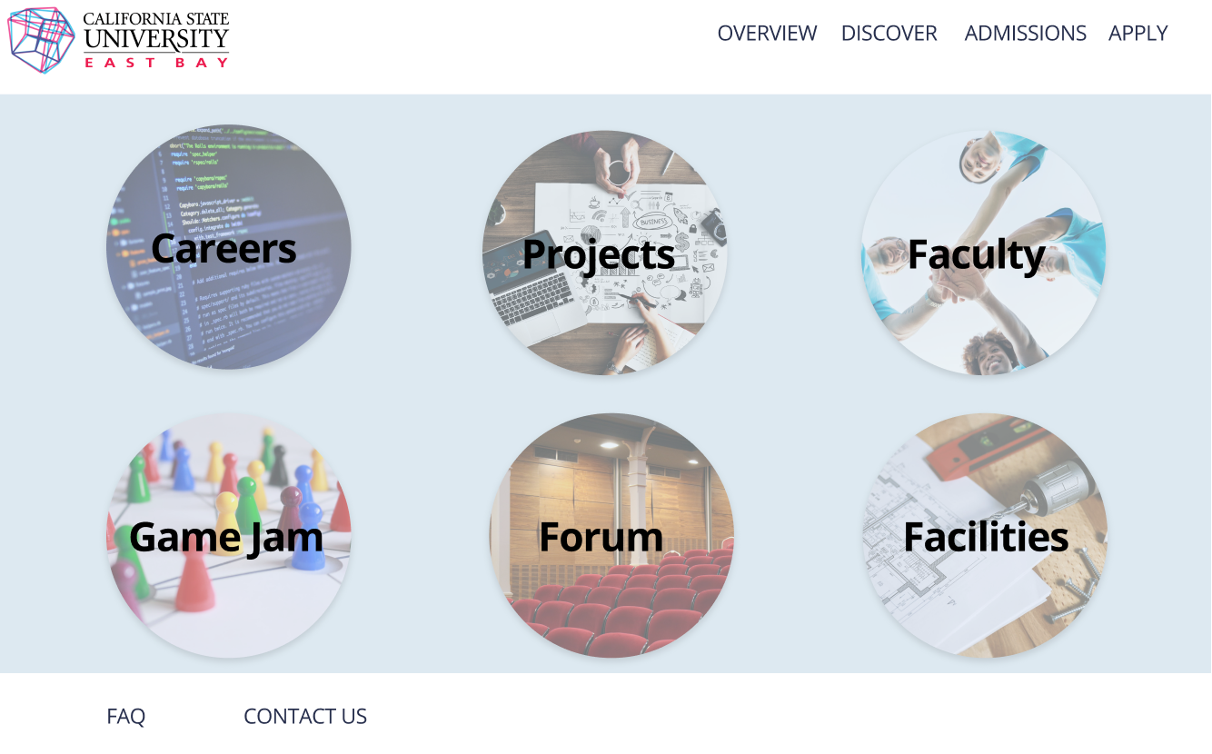
For our wireframes, we decided to focus on 2 flows of the project. The first flow is the homepage/landing page. Top wireframes indicate flows from the home page to the discover page where users will be able to explore different aspects, such as staff, facilities, careers, and important events.
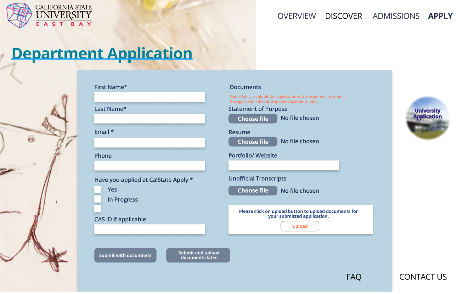
Bottom wireframes indicate the application page, from filling out application forms for each department. We designed something where it’s straightforward and easily readable.
Overall, we chose these two specific flows to wireframe and design because we wanted to make the beginning to end as clear as possible.
High Fidelity Wireframes


